Saturday, December 22, 2012
In this second video I have defined more the lines of the house, adding shutters, a stone texture for the new chimney, detail to the front windows, some bushes and a new fence, video.
Monday, December 17, 2012
Adding a wrap-around porch to a house
In this video you will learn how we can start drawing a wrap-around porch in a small house. We will find the horizon line and the vanishing points, using a photograph under tracing paper, video.
Wednesday, May 9, 2012
How to draw texture on bedding material
In this video we have worked in showcasing texture on the bed, separating visually the pillows from the bed cover, video.
Saturday, May 5, 2012
Discussion on high and low horizon lines
In this discussion we are analyzing the differences between a high and low vantage point in this bedroom and we discuss what areas we focus on each of the two scenarios, video.
Wednesday, April 25, 2012
Understanding details on a bathroom cabinet
In this video you will learn how to draw better drawers and how to show that drawers and doors could be opened, video
Sunday, April 15, 2012
Rendering with recessed light sources
In this video you will learn how to recessed lights affect our walls and other surfaces, video.
Wednesday, April 11, 2012
Tuesday, April 3, 2012
Locating figures in a reception area
In this video we discuss the importance of adding figures to our scenes, making sure that they relate to the Horizon Line, video.
Thursday, March 29, 2012
How to render easy geometric shapes
Most design renderings usually have combinations of these simple geometric shapes. Let's review how shadows affect a cylinder, a cone and a sphere, video.
How to draw a recliner
In this video you will learn how to draw a recliner, making sure that the vanishing points are kept in check, video.
Tuesday, March 27, 2012
How to represent textures
In this small video you will learn how to represent effectively textures and shadows over an area rug, and how to create highlights and texture on a coffee table, video.
Sunday, March 25, 2012
How to draw windows
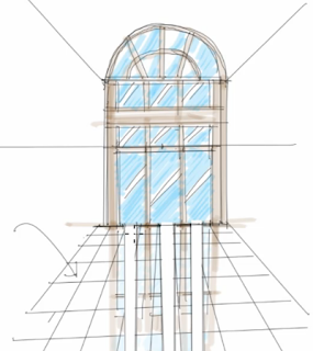
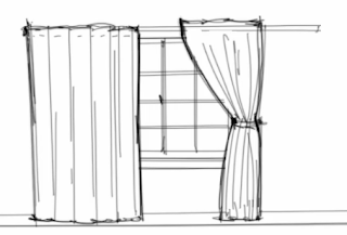
Quite often we overlook how to draw a window in a perspective with enough detail to show how it operates. Take a look at this video that will show you how we can quickly add more detail to our windows, video.
Thursday, March 22, 2012
How to work with Adobe Photoshop on rendering
Rendering using Adobe Photoshop can be very fun, especially if you are looking to work with reflections and highlights, video.
Tuesday, March 20, 2012
How to draw shadows on a floor plan
Figuring out how to do our shadows properly in a floor plan can take
some practice. Take a look at this quick trick that will allow you to
situate most of your shadows correctly, using tracing paper, video.
How to render stone
Creating
interesting a stone wall that looks three dimensional in an elevation
can be challenging. In this video we will cover how to work with our
shadows and lineweights, video.
Thursday, March 15, 2012
What is an elevation?
Quite often as we start to study interior design, we get confused on what is an elevation and what is not. In this demonstration we are showing how an armchair and a circular table can be drawn in an elevation, and will show some common mistakes that can happen, video.
Wednesday, March 14, 2012
Monday, March 12, 2012
Working on a sofa design with a lamp
In this video we worked on a sofa design with a lamp behind, making sure that it looked soft and comfortable. Drawing the edges well is especially important, video.
Working with reflections
In this video we discuss how to work with a highly reflective floor; the window frames appear on the floor but in reverse, right under the floor grid, video.


Labels:
interior design rendering,
reflections,
shiny spots
Saturday, March 10, 2012
Giving depth to an elevation
In this video you are going to learn how to give some depth to a bookcase with some open cubbies that otherwise would look flat on an elevation,
Tuesday, March 6, 2012
Starting a perspective of a living room
In this video demonstration we are going to learn how to start a perspective of a living room, from the ground up, video. Notice how we started with the bare walls and how the furniture footprints were added on the floor and then vertical lines were added.
Subscribe to:
Posts (Atom)


